Source: chapoo.be ? 2025 Chapoo Antwerp. License: All Rights Reserved.


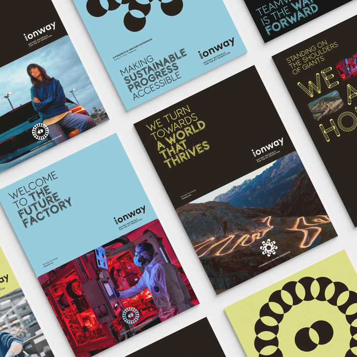
Branding agency Chapoo from Antwerp created the identity for the joint venture between Umicore and VolkswagenˇŻs battery maker PowerCo. The corporate identity makes heavy use of the typeface Purple Haze by Font Spectrum, adding some custom icons and animations to the variable font.
The logotype of ionway is a mixture of a Purple Haze-like i with the rest of the word set in FF Mark Heavy by Hannes van D?hren and Christoph Koeberlin. FF Mark also does the heavy lifting in print materials. On the ionway website, however, the typeface has been replaced with Open Sans, while Purple Haze is used for titles. Readers can speculate themselves why this might be the case.
The typeface creates a futuristic look that fits the scientific and progressive targets of electrifying our private and public transport systems. The name ˇ°ionwayˇ± is a combination of the raw battery material and the companyˇŻs end goal: thanks to high-performance lithium-ion batteries, travelling with significantly lower CO2 emissions.

Source: chapoo.be ? 2025 Chapoo Antwerp. License: All Rights Reserved.
Source: chapoo.be ? 2025 Chapoo Antwerp. License: All Rights Reserved.
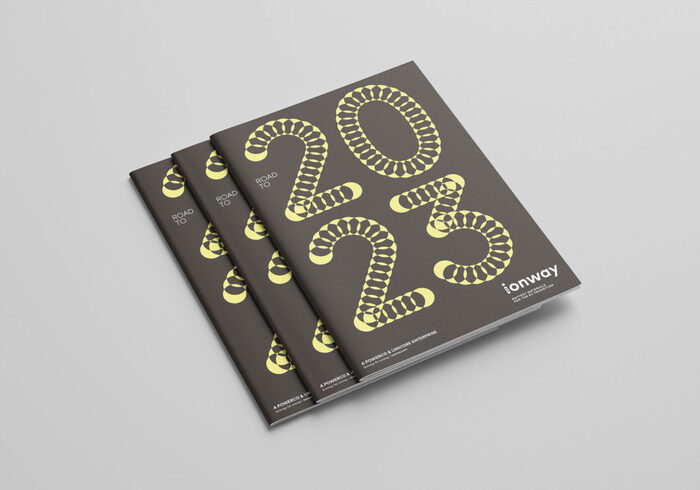
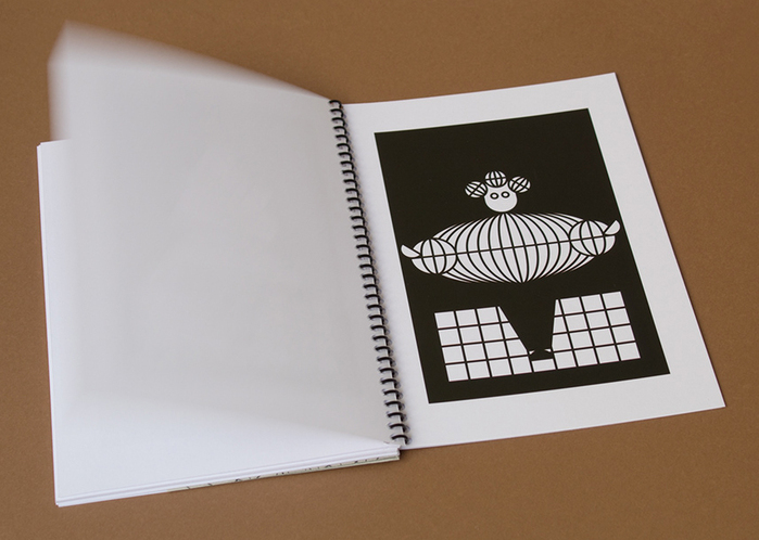
Annual report for 2023 with a festive cover featuring Purple Haze
Source: chapoo.be ? 2025 Chapoo Antwerp. License: All Rights Reserved.
Custom animated icons, made by the Antwerp based branding agency Chapoo
Source: chapoo.be ? 2025 Chapoo Antwerp. License: All Rights Reserved.
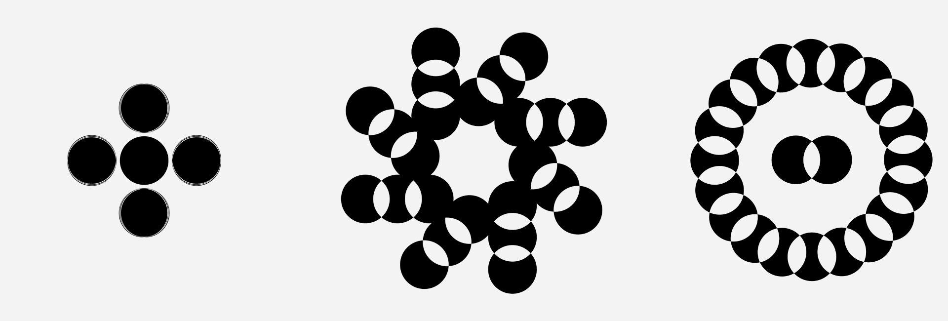
The logotype with an i built from intersecting circles similar to the ones in Purple Haze. The rest is set in FF Mark Heavy.
Source: chapoo.be ? 2025 Chapoo Antwerp. License: All Rights Reserved.
Construction sketch for the logo
Source: chapoo.be ? 2025 Chapoo Antwerp. License: All Rights Reserved.
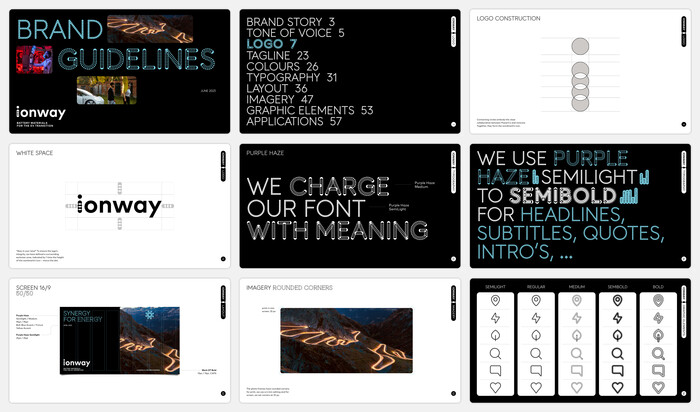
An overview of the brand guidelines
This post was originally published at Fonts In Use
]]>
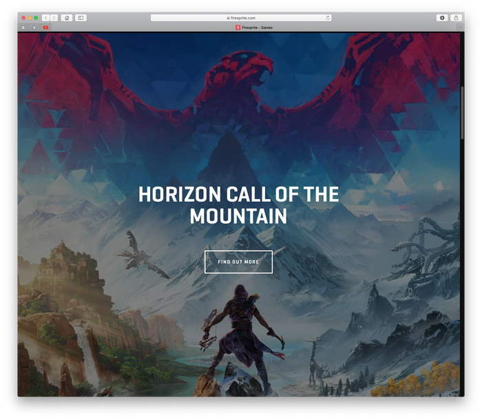
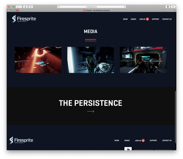
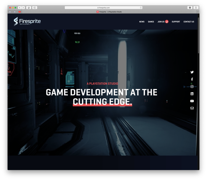
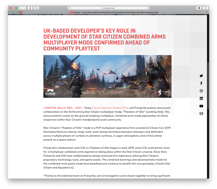
Source: www.firesprite.com License: All Rights Reserved.
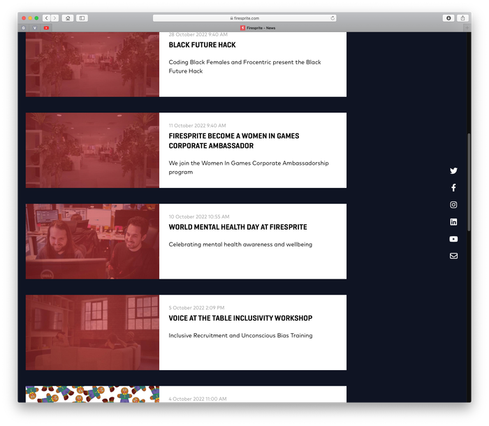
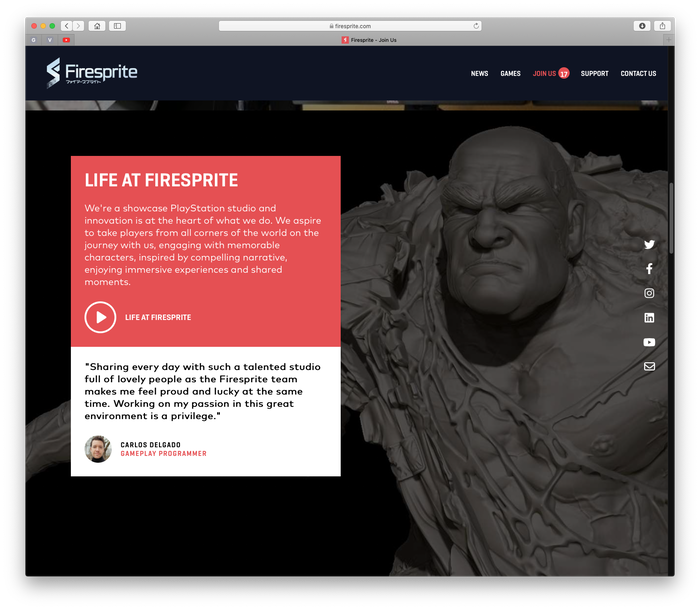
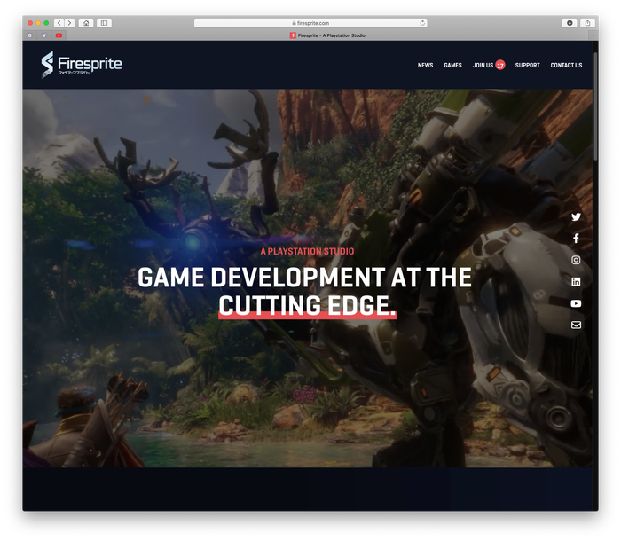
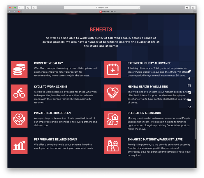
Firesprite are an innovative first party PlayStation development studio based in Liverpool, UK, with over 200 experienced developers creating cutting edge games. Their portfolio website uses all caps Geogrotesque Sharp (an updated, sharper version of Geogrotesque) for headlines, subheaders and page navigation, alongside FF Mark.
Source: www.firesprite.com License: All Rights Reserved.
Source: www.firesprite.com License: All Rights Reserved.
Source: www.firesprite.com License: All Rights Reserved.
Source: www.firesprite.com License: All Rights Reserved.
Source: www.firesprite.com License: All Rights Reserved.
Source: www.firesprite.com License: All Rights Reserved.
Source: www.firesprite.com License: All Rights Reserved.
This post was originally published at Fonts In Use
]]>
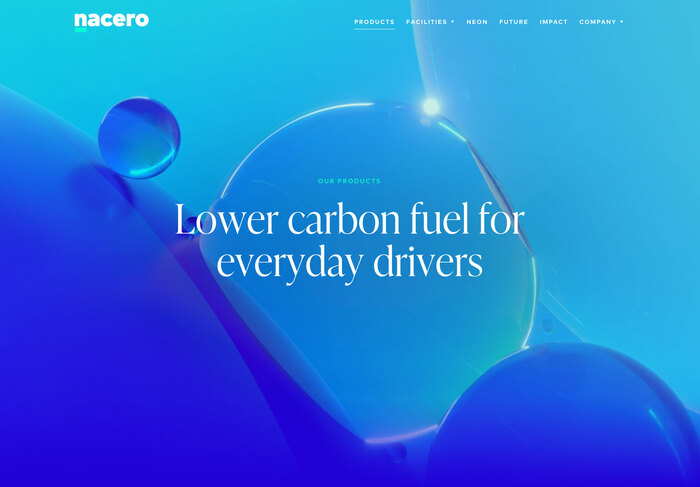
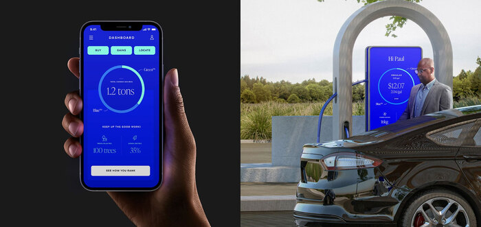
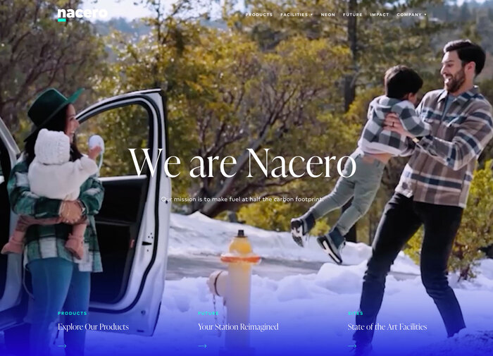
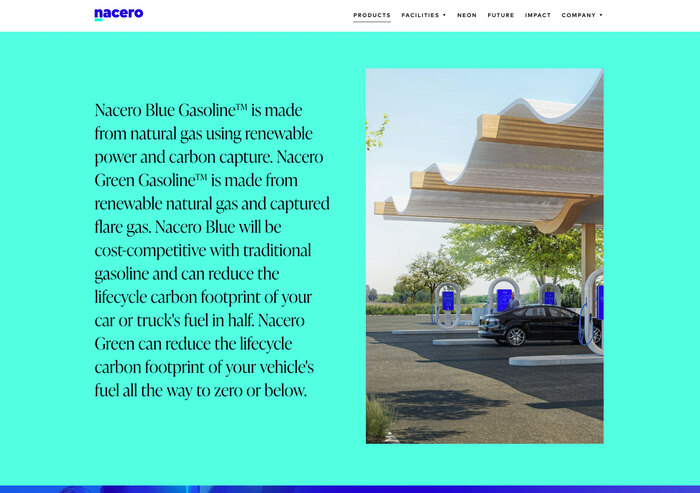
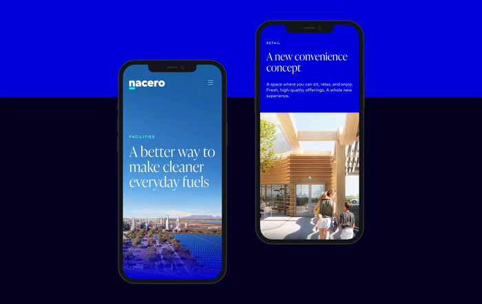
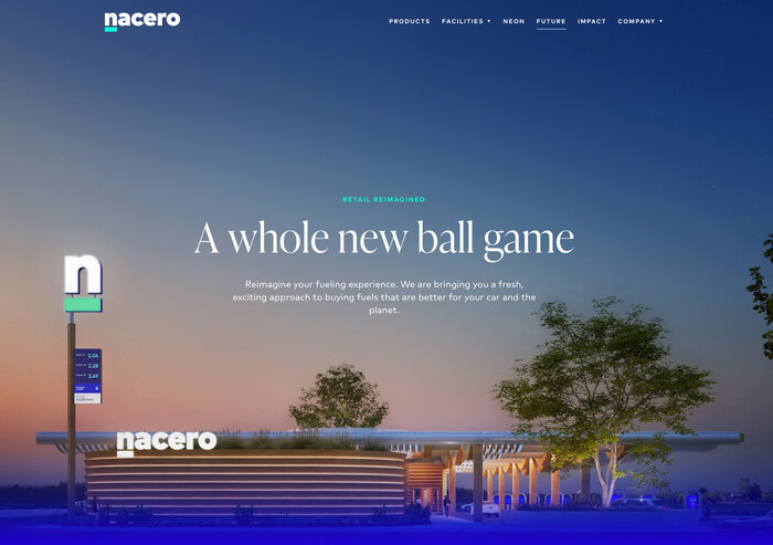
Source: nacero.co License: All Rights Reserved.

Nacero accelerates a cleaner future with products that enable everyday drivers to reduce carbon emissions. Their new brand experience was created by Edenspiekermann:
The new identity was built around two core concepts: A logo mark that underscored their new approach to an old industry, and a brand strategy that centered around the idea that you can change the world without changing your car. This visionary spirit was reflected accross all touchpointsˇŞa fresh visual palette, aspirational lifestyle photography, and innovative service experiences.
The headline font is IvyPresto. It is combined with FF Mark for navigation. The wordmark is custom.
EdenSpiekermann. License: All Rights Reserved.
Source: nacero.co License: All Rights Reserved.
Source: nacero.co License: All Rights Reserved.
EdenSpiekermann. License: All Rights Reserved.
Source: nacero.co License: All Rights Reserved.
This post was originally published at Fonts In Use
]]>
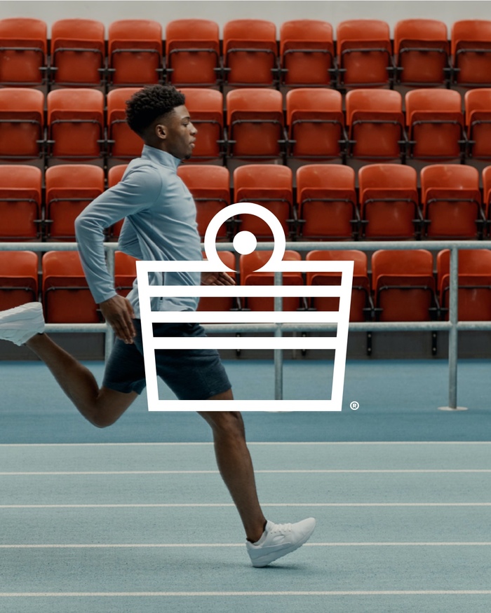
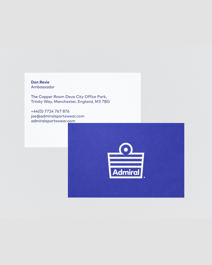
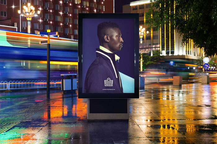
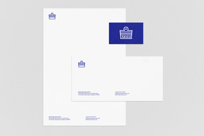
Source: anewkindofkick.com A New Kind Of Kick. License: All Rights Reserved.
Reinventing Admiral, the classic English sports brand. Gaining notoriety in 1974 when it produced the first commercially available England football shirt that featured a sportswear manufacturers logo.
Finding a new sense of purpose and direction built around the rebel, pioneer spirit they had lost over the years. This gave us a foundation to refresh their identity and give creative direction to their entire range.
Identity uses FF Mark.
Source: anewkindofkick.com A New Kind Of Kick. License: All Rights Reserved.

Source: anewkindofkick.com A New Kind Of Kick. License: All Rights Reserved.
Vintage ads and logo featuring Antique Olive and Kabel Black (for reference)
Source: anewkindofkick.com A New Kind Of Kick. License: All Rights Reserved.
Source: anewkindofkick.com A New Kind Of Kick. License: All Rights Reserved.
Source: anewkindofkick.com A New Kind Of Kick. License: All Rights Reserved.

Source: anewkindofkick.com A New Kind Of Kick. License: All Rights Reserved.
This post was originally published at Fonts In Use
]]>
Studio K95. License: All Rights Reserved.
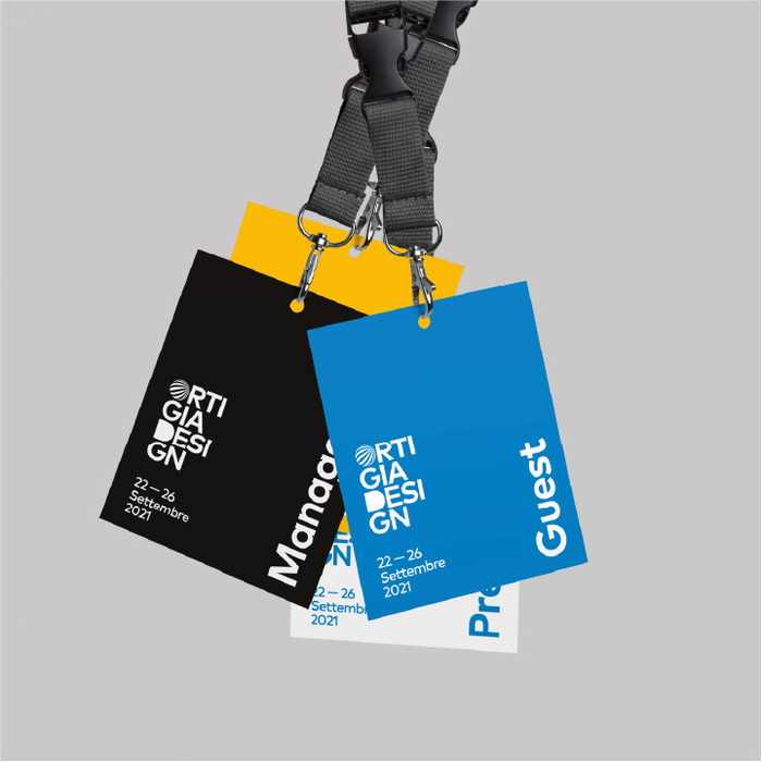
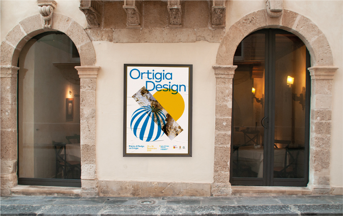
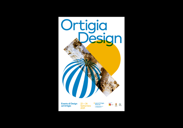
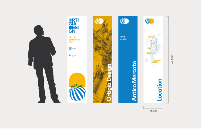
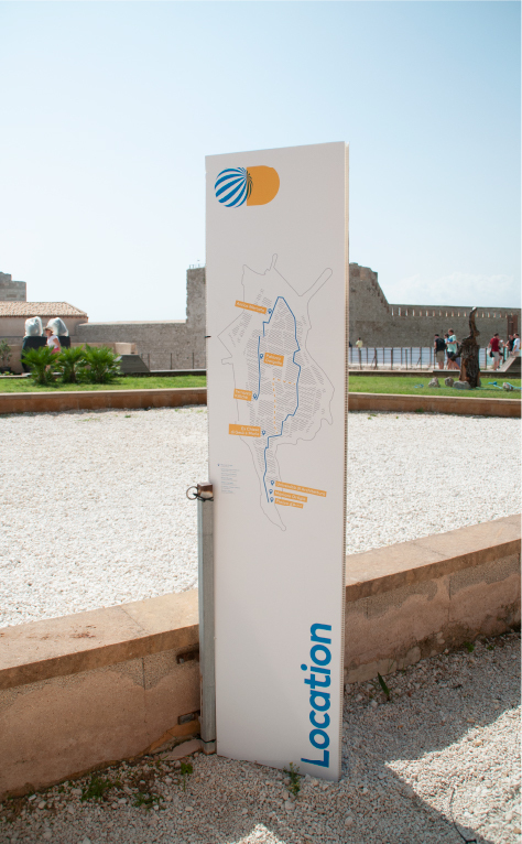
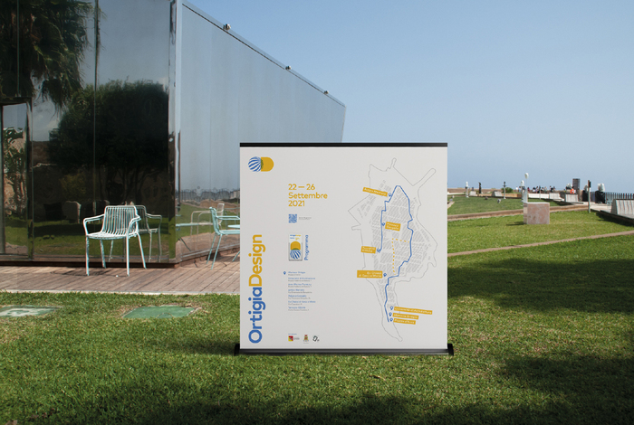
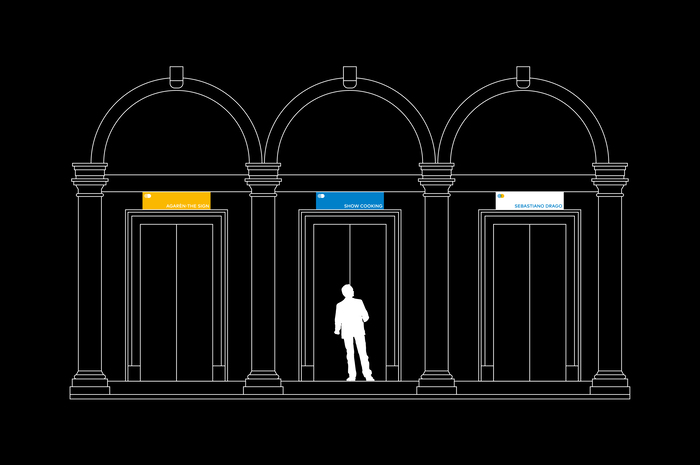
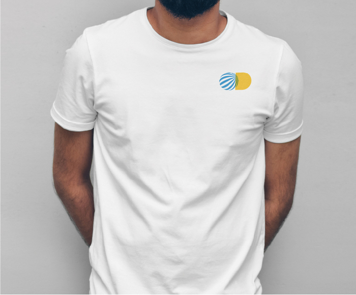
Ortigia Design is a design event that took place on Ortigia Island, Syracuse, Italy from 22 to 26 September 2021. The event involved some important design brands such as Bertone Design, Man To Design, San Lorenzo Yachts, architects and designers from all over the world. The event organisers asked us to design the identity of the first edition of the festival. The aim was to design a brand linked to the territory, but capable of conveying a sense of design.
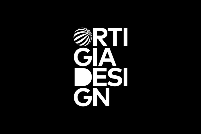
Taking two simple geometric shapes, square and circle, as a model, we drew an O and a D full, initials of the words Ortigia and Design, joining them to obtain a first simple symbol.
During the five days of the event, Ortigia became the meeting point of world design. That is why we turned the O into a globe, whose lines converge in the centre, it also appears as a 3D design object close to the concept of Optical Art. We wanted a symbol that would attract the public's attention, that would become strong and recognisable even if not accompanied by the logotype.
We chose to colour the O in cyan, to recall the colour of the sky and the sea, and the D in a warm yellow, for the colours of the island, whose architecture composed mainly of white stone actively interacts with the reflections of the sun. Finally, we slightly overlapped the two symbols, obtaining a chromatic and overprinting effect that characterised Italian graphics and design from the 1960s onwards.
We went beyond the simple symbol and logo, thinking of a second use of the mark that could be applied as an alternative to the first, depending on the type of use. A second, totally typographic mark, in which the previously created symbol continues to be present.
For Ortigia Design we created the design of the social campaign and the press kit, posters, brochures, programme, invitations, totems, signs and banners. For five days the island was filled with the OD symbol, which went viral, blending perfectly with the architecture of the site.

License: All Rights Reserved.

License: All Rights Reserved.
License: All Rights Reserved.
License: All Rights Reserved.
License: All Rights Reserved.

License: All Rights Reserved.
License: All Rights Reserved.
License: All Rights Reserved.

License: All Rights Reserved.
License: All Rights Reserved.
License: All Rights Reserved.

License: All Rights Reserved.
License: All Rights Reserved.
This post was originally published at Fonts In Use
]]>

Source: www.behance.net Photo: Georgia Harizani. Georgia Harizani. License: All Rights Reserved.

On the occasion of the International Day of Families, photographer Stefanos Tsakiris extended an open invitation to all families offering a free studio photoshoot and a visit to his open studio exhibition.
The invitation design aims to communicate without distracting the visitor from the main exhibit: family portraits. The display typeface Canela (Miguel Reyes) was used. As stated by Commercial Type, it is ˇ°a graceful display typeface that defies many of the traditional classifications, its forms are in an ambiguous space between sans and serif, both soft and sharp, modern yet with roots in the classicalˇ±. Canela is a beautiful example of the classic coexisting with the modern, a concept also reflected within the photographerˇŻs idea to capture ˇ®traditional family portraitsˇŻ with a distinctive, contemporary aesthetic.
Canela works in conjunction with and contradiction to the photographerˇŻs visual identity, where the sans serif FF Mark is applied for all typography. On the invitation, it is used for the the photographerˇŻs logo. By choosing a contrasting typeface, I aimed to create a ˇ®visual dialogueˇŻ and a clear distinction between the professional and the event.
This post was originally published at Fonts In Use
]]>
License: All Rights Reserved.
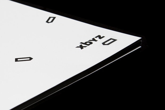
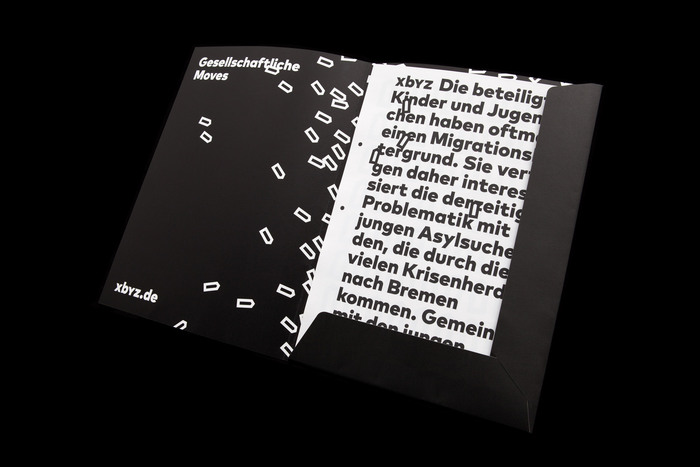
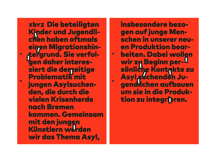
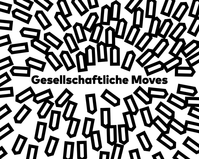
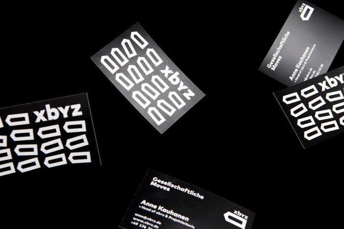
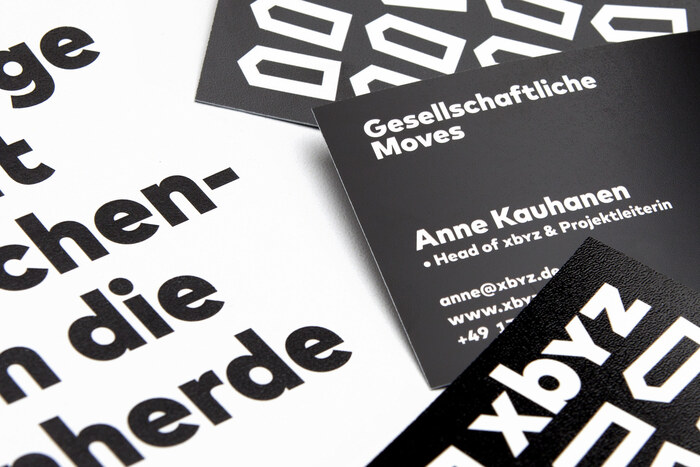
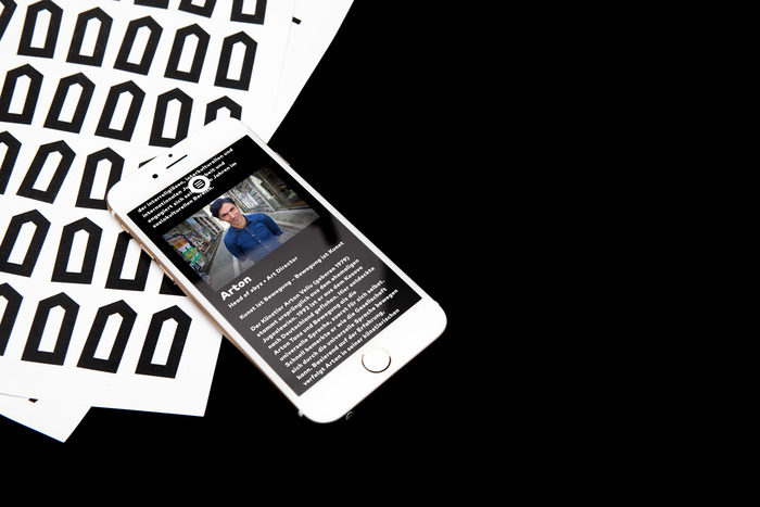
xbyz initiates dance, theater or movie performances in collaboration with young people. The project demands high individual commitment and responsibility. This stimulates will power and curiosity among all participants. Each participant's situation appears in different light and suddenly carries new potential.
Together xbyz and NAMENAME walked the extra mile: from the very founding of the project to defining the brand core to elaborating the project profile and its services. The printed matter shown here combine arrows that seem to be moved by magnetic power, a strong red and black color palette and FF Mark in use for all typography.
NAMENAME Creative Partners. License: All Rights Reserved.
NAMENAME Creative Partners. License: All Rights Reserved.
NAMENAME Creative Partners. License: All Rights Reserved.
NAMENAME Creative Partners. License: All Rights Reserved.
NAMENAME Creative Partners. License: All Rights Reserved.
NAMENAME Creative Partners. License: All Rights Reserved.
This post was originally published at Fonts In Use
]]>
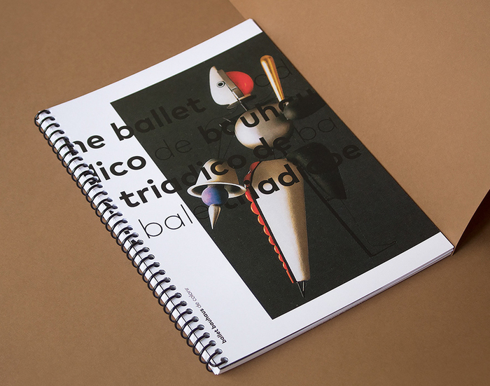
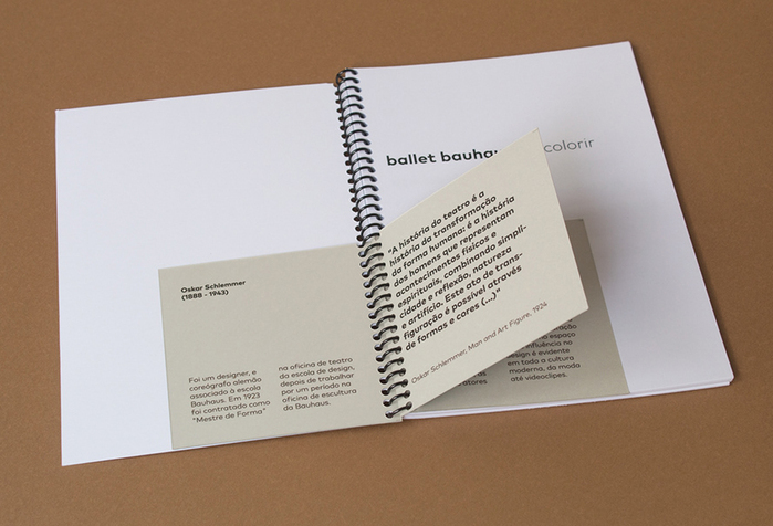
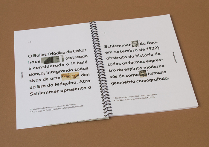
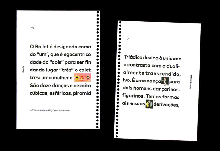
Source: www.behance.net Bruno Ponceano. License: CC BY-NC-ND.
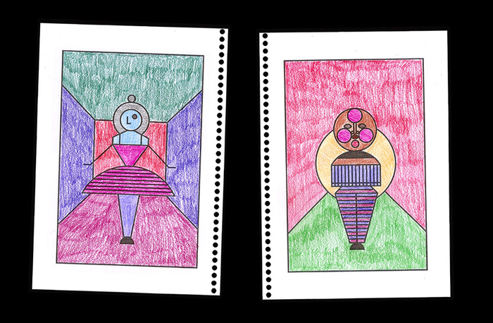
This Bauhaus Ballet coloring book is inspired by the Triadic Ballet. Developed by Oskar Schlemmer, it premiered in Stuttgart, Germany on 30¨C31 September 1922. The ballet became the most widely performed avant-garde artistic dance. While Schlemmer was at the Bauhaus from 1921 to 1929, the ballet toured, helping to spread the ethos of the Bauhaus. ˇŞ Wikipedia
The font used in this project is FF Mark, a typeface rooted in the 1920s German geometry.
Source: www.behance.net Bruno Ponceano. License: CC BY-NC-ND.
Source: www.behance.net Bruno Ponceano. License: CC BY-NC-ND.
Source: www.behance.net Bruno Ponceano. License: CC BY-NC-ND.
Source: www.behance.net Bruno Ponceano. License: CC BY-NC-ND.
Source: www.behance.net Bruno Ponceano. License: CC BY-NC-ND.
This post was originally published at Fonts In Use
]]>

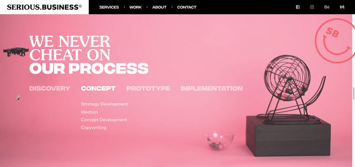
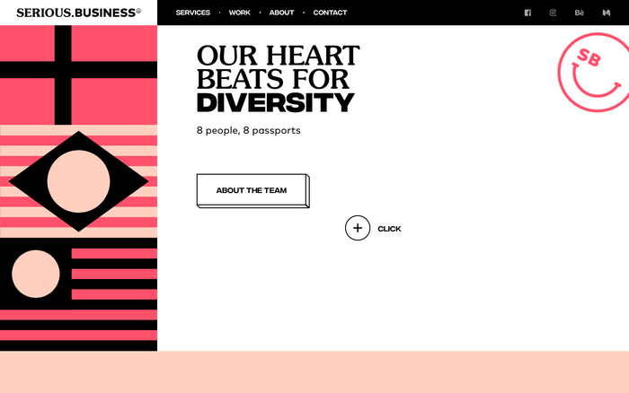
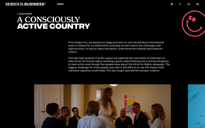
Source: serious.business serious.business agency. License: All Rights Reserved.
serious.business is an agency that started in 2015 in Stockholm, and currently operating from M¨ąnchen, Germany. Its website uses 3 different typefaces. One of them is FF Mark, used for the text. But the astonishing thing is the couple of typefaces chosen for the titles: the very wide and bold Integral CF and a popular display font from the 1970s, ITC Souvenir.
Source: serious.business serious.business agency. License: All Rights Reserved.

Source: serious.business serious.business agency. License: All Rights Reserved.
Source: serious.business License: All Rights Reserved.
Source: serious.business License: All Rights Reserved.
This post was originally published at Fonts In Use
]]>
Source: www.behance.net Photo: nils poppe. License: All Rights Reserved.
Corporate design for Hamburg based "metameter" ¨C a company for architecture and marketing solutions. To create a bold icon and lettering, FF Mark is chosen, presenting an architectural strong-constructed, solid character. The seemingly monolinear characters proved to work very well for implementing a stencil effect, even when switching between the font weights.
Photo: nils poppe. License: All Rights Reserved.
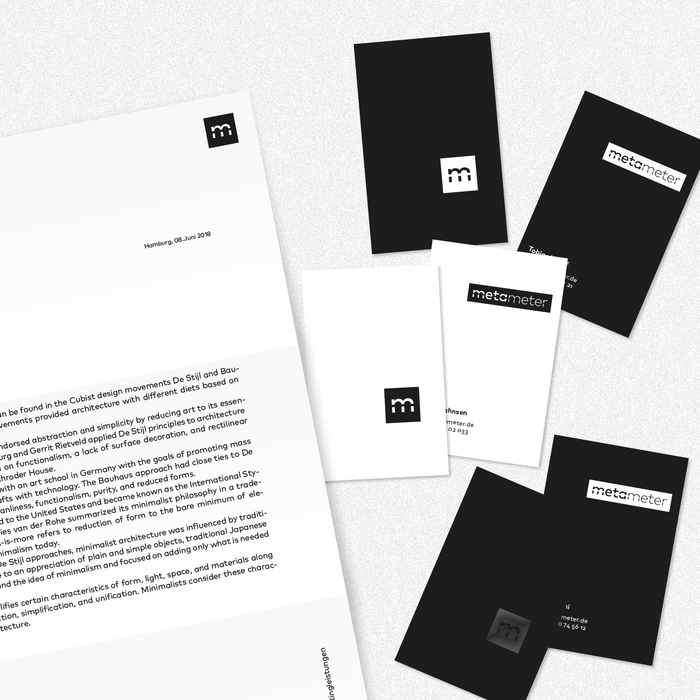
Photo: nils poppe. License: All Rights Reserved.

Photo: nils poppe. License: All Rights Reserved.
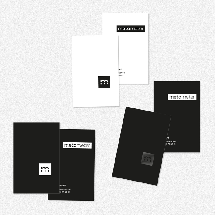
Photo: nils poppe. License: All Rights Reserved.

Photo: nils poppe. License: All Rights Reserved.
This post was originally published at Fonts In Use
]]>
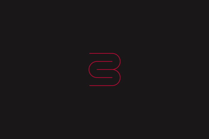
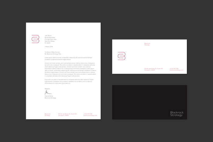
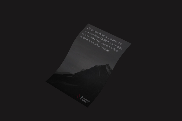
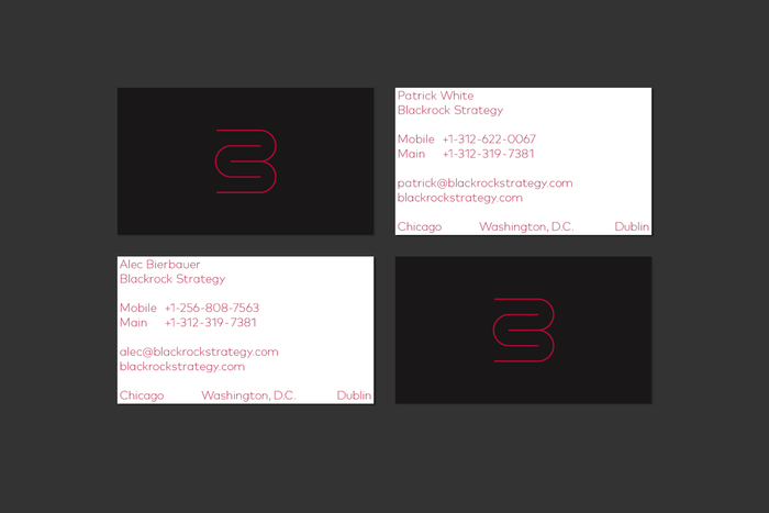
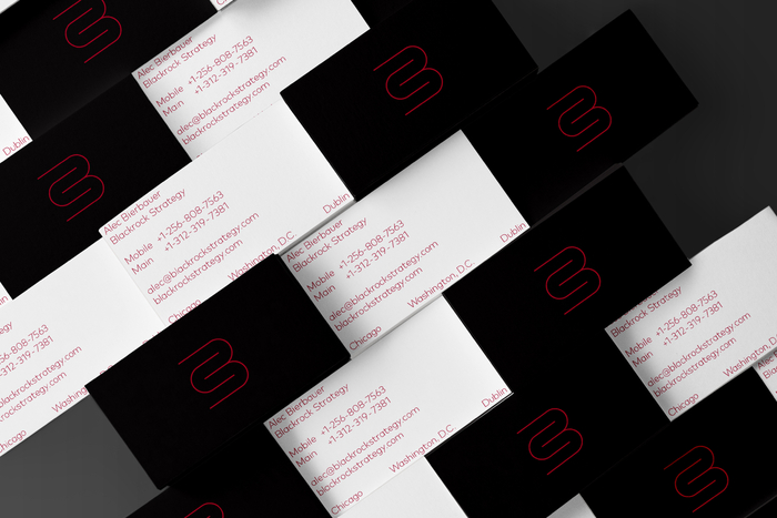
Source: grandson.ie License: All Rights Reserved.
Blackrock Strategy is an international risk management company focused on providing commercial and government clients with the best insights and intelligence available to make informed decisions for their people and stakeholders.
We were tasked with creating a brand identity for this multinational entity, working within the areas of security | recognisance | logistics | strategy. We produced a robust brandmark ¨C drawing on classic modernist logotype principles. Using an ambiguous suite of photographic content, pared with a darkened color palette, to produce a sleek and refined brand identity.
Source: grandson.ie License: All Rights Reserved.
Source: grandson.ie License: All Rights Reserved.
Source: grandson.ie License: All Rights Reserved.
Source: grandson.ie License: All Rights Reserved.
Source: grandson.ie License: All Rights Reserved.
This post was originally published at Fonts In Use
]]>
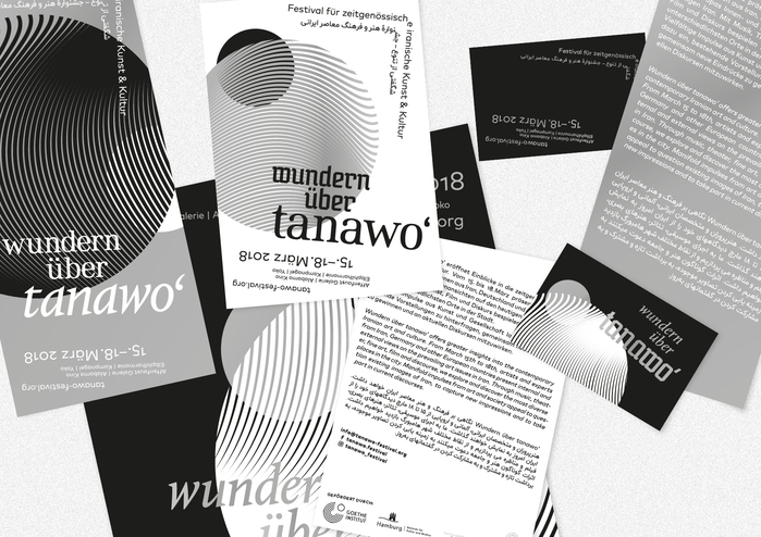
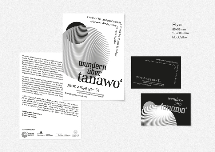
License: All Rights Reserved.


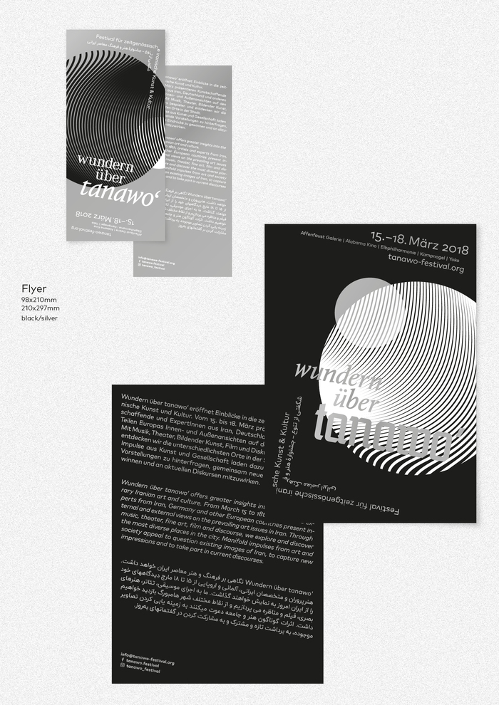
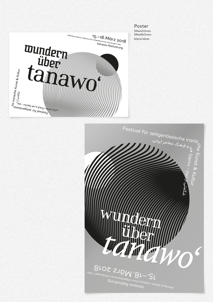
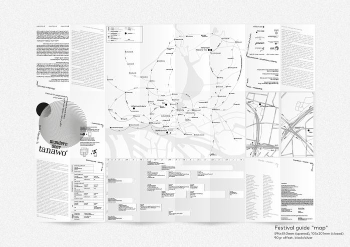
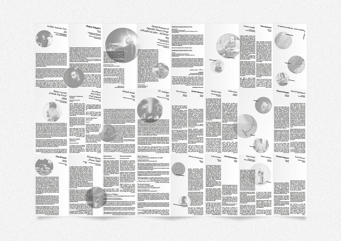
Wundern ¨ąber tanawoˇ® is a festival for contemporary Iranian art & culture. See the full project and design concept on Behance.
License: All Rights Reserved.
License: All Rights Reserved.
License: All Rights Reserved.
License: All Rights Reserved.
License: All Rights Reserved.
This post was originally published at Fonts In Use
]]>
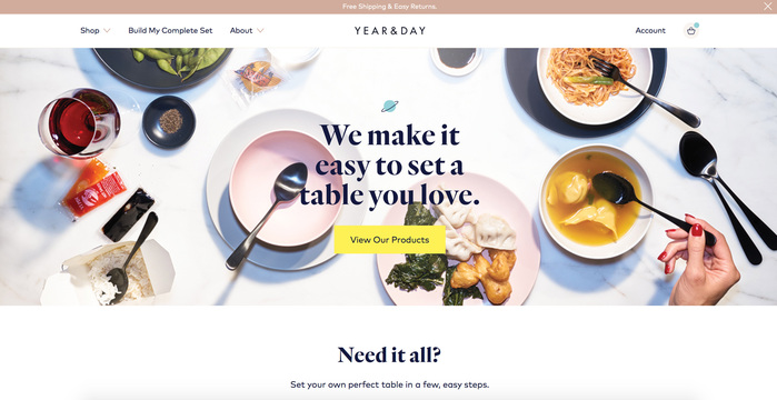
Source: yearandday.com License: All Rights Reserved.

Year & Day is a new direct-to-consumer ceramics and flatware brand. Their website was designed by Dynamo, in Montreal, using FF Mark and Quarto as part of the branding.
This post was originally published at Fonts In Use
]]>
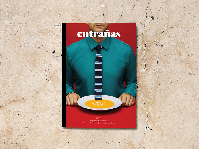
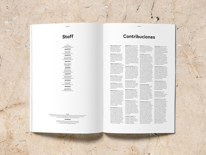
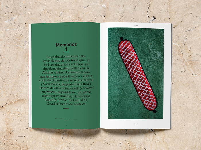
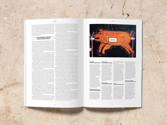
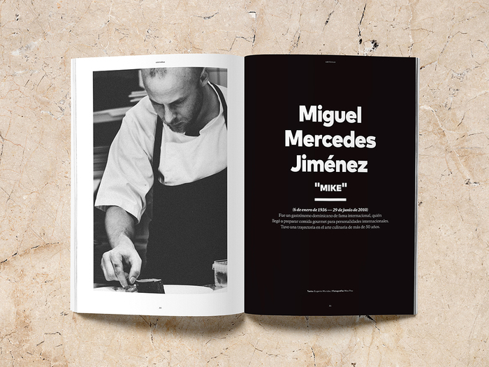
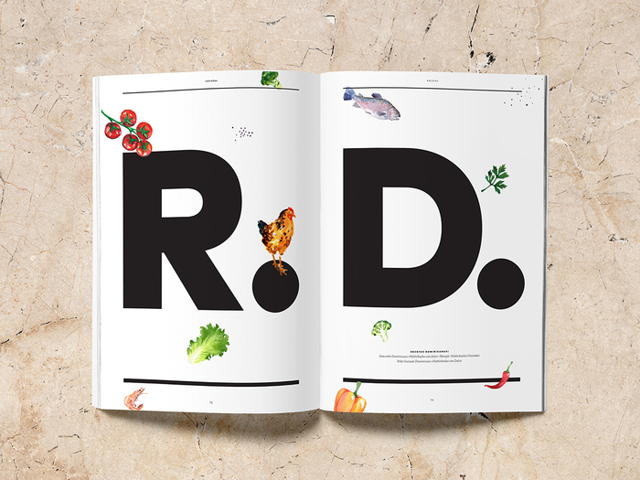
Source: www.marcosilfa.com Marcos Silfa. License: All Rights Reserved.


Entra?as is a magazine about origin and evolution of culture gastronomy in Latin America. Its mission is to spread the gastronomy and its values ˇŞ from the preparation of rudimentary food of the first settlers of each country and its regions to the current gastronomy ˇŞ and to strengthen cultural identity.
The project was developed during the Graphic Design and Publishing Projects Postgraduate Program at Elisava, School of Design and Engineering of Barcelona, under the direction of ?scar Germade (Solo ¨C Barcelona). This is a non-commercial project. All content belong to their authors.
Source: www.marcosilfa.com Marcos Silfa. License: All Rights Reserved.
Source: www.marcosilfa.com Marcos Silfa. License: All Rights Reserved.
Source: www.marcosilfa.com Marcos Silfa. License: All Rights Reserved.
Source: www.marcosilfa.com Marcos Silfa. License: All Rights Reserved.
Source: www.marcosilfa.com Marcos Silfa. License: All Rights Reserved.
This post was originally published at Fonts In Use
]]>
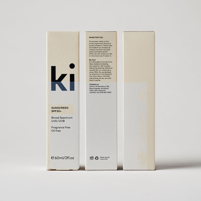
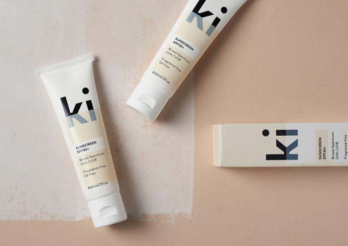
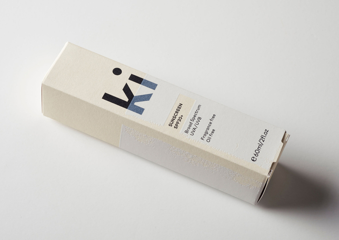
License: All Rights Reserved.
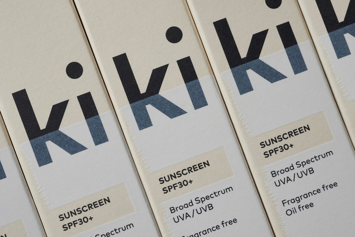
Ki Sunscreen was developed by national skincare clinic Caci to protect against the harsh New Zealand sun, and the skin damage and premature ageing that UVA and UVB rays can cause. It is made from the latest generation of ingredients proven to protect, and those that help to control oils and maintain a matt finish. This balance between clinically proven effectiveness and cosmetic mindfulness is expressed by its brand identity and packaging design, developed by Auckland studio Akin, in the meeting of a bold black logotype built from FF Mark, and the material interaction between uncoated paper and print finish.
Read more about this project on BP&O.
License: All Rights Reserved.
License: All Rights Reserved.
License: All Rights Reserved.
This post was originally published at Fonts In Use
]]>
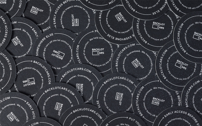
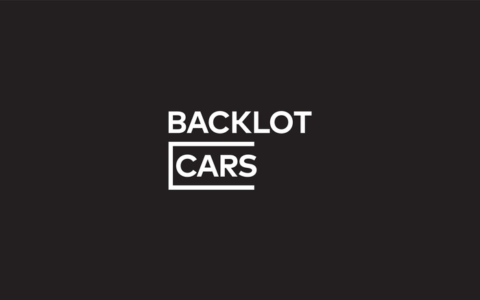
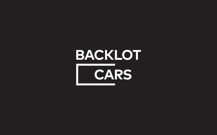
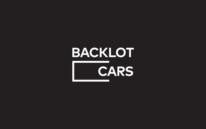
Source: merylvedros.com Photo: Meryl Vedros. License: All Rights Reserved.
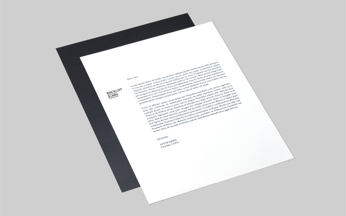
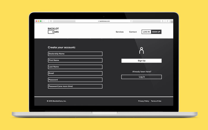
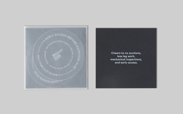
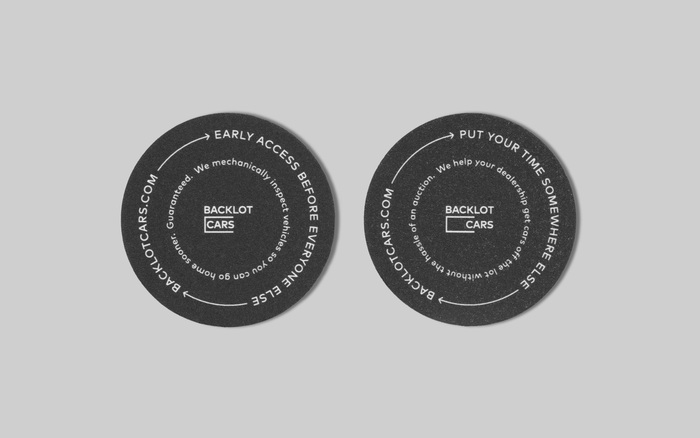
A comprehensive rebrand for a start-up striving to redefine car sales by getting cars off the lot without the hassle of an auction. The wordmark set in FF Mark quite literally shows what they do while still evoking the approachability and simplicity of the company.
Source: merylvedros.com Photo: Meryl Vedros. License: All Rights Reserved.
Source: merylvedros.com Photo: Meryl Vedros. License: All Rights Reserved.
Source: merylvedros.com Photo: Meryl Vedros. License: All Rights Reserved.
Source: merylvedros.com Photo: Meryl Vedros. License: All Rights Reserved.
Source: merylvedros.com Photo: Meryl Vedros. License: All Rights Reserved.
Source: merylvedros.com Photo: Meryl Vedros. License: All Rights Reserved.
Source: merylvedros.com Photo: Meryl Vedros. License: All Rights Reserved.
This post was originally published at Fonts In Use
]]>
License: All Rights Reserved.


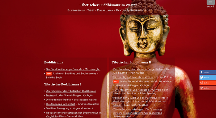
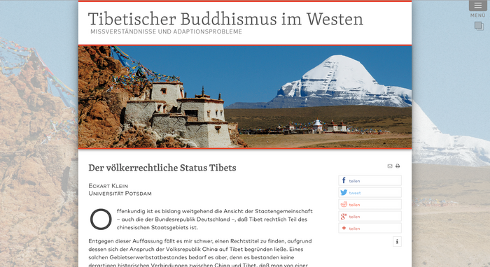
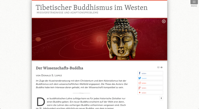
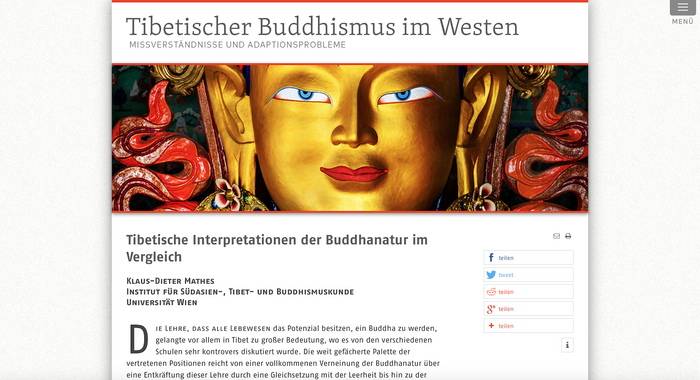
This site addresses complex issues related to Tibet, Tibetan Buddhism, the Dalai Lama as well as Buddhism in general.
The general typeface for the site is FF Mark ¨C sometimes also FF Mark Narrow is used. For headings Skolar PE Semibold is used. The logo uses Skolar paired with FF Mark.
Since the vast majority of academic writing that uses Sanskrit is conducted in transliteration, another typeface, FF Fago, is used for those (few) articles.
See also the English-language sibling of this website on Fonts In Use.
License: All Rights Reserved.
License: All Rights Reserved.
License: All Rights Reserved.
This post was originally published at Fonts In Use
]]>

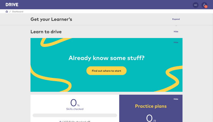
Source: drive.govt.nz Photo: Heyday. License: All Rights Reserved.
Drive is an award-winning partnership between ACC and NZTA that delivers a comprehensive interactive digital experience to replace the paper road code and create better drivers ˇŞ ultimately reducing the number of young driver fatalities on New Zealand roads.

License: All Rights Reserved.
License: All Rights Reserved.
This post was originally published at Fonts In Use
]]>
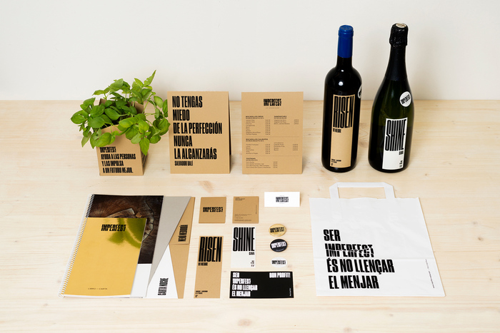
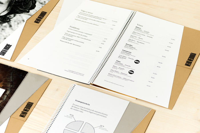
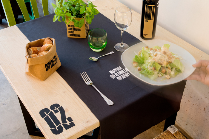
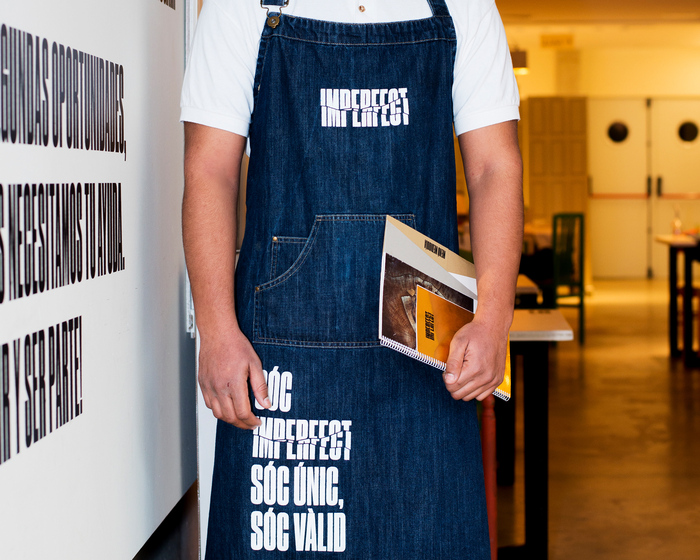
Source: www.srysrawilson.com Photo: Koldo Castillo. License: CC BY-NC.


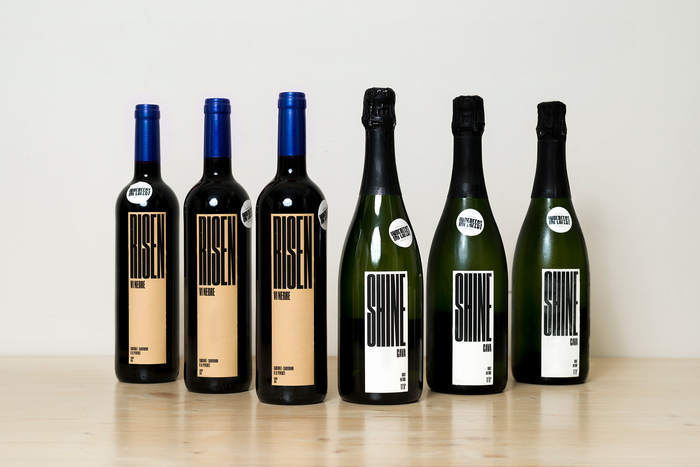
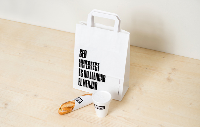
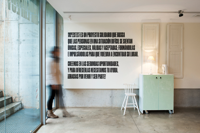
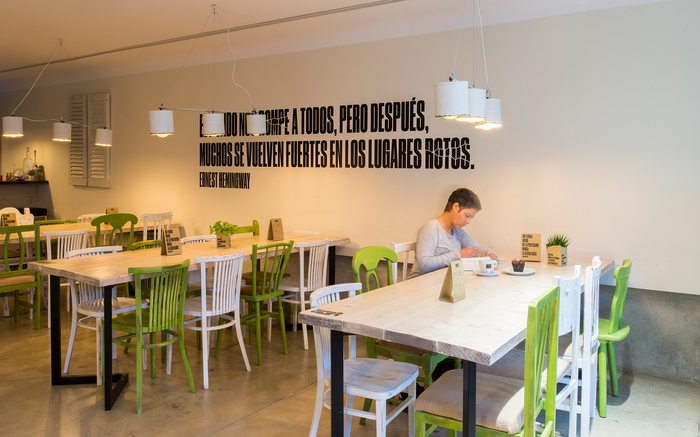
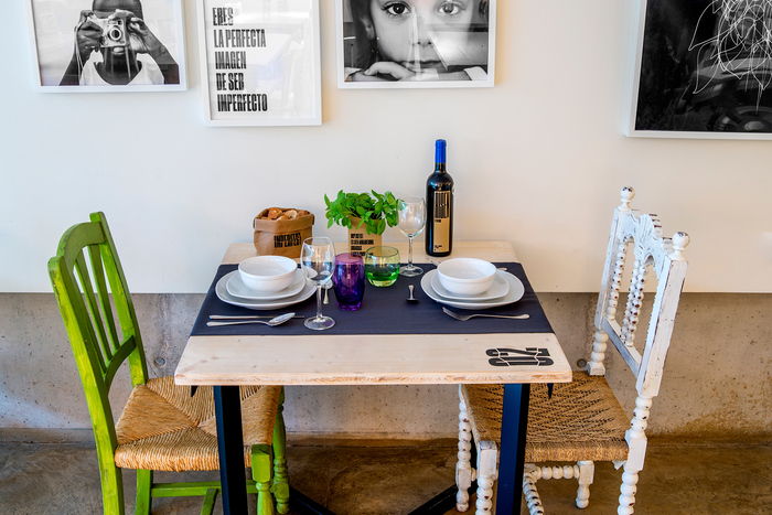
Imperfect is a community restaurant that was created with the aim of helping people at risk of social exclusion to reintegrate into society, by offering personal help and training in catering. It is a local project that aims to serve the community and focuses on reintegrating people into society and work. The brand essence, ˇ®we love imperfectionˇŻ, speaks of giving a second chance ¨C it has an impact on everyone who goes through the programme and they clearly learn that although we are all imperfect, we are all useful and valuable.
Sr. y Sra. Wilson created the brand strategy and identity and were in charge of the naming and the design of coordinated elements in the restaurant, as well as the signage. We also helped to design some of the spaces in the restaurant.
We wanted to use design to communicate the message and values of Imperfect, and to help to promote a social project that has an impact on people ¨C on those who take part in this social programme and also on the customers, as they are invited to reflect on and identify with the project when they come to the restaurant.
To develop the branding we drew on the philosophy of the Japanese technique of ˇ®kintsugiˇŻ, which views breakage and repair as part of the history of an object that should be displayed instead of disguised, as this history and transformation makes the object even more beautiful. Imperfect is ˇ®kintsugiˇŻ applied to people.
We created an identity based on direct messages to users, to raise awareness of how ˇ®we love imperfectionˇŻ, to highlight that imperfection can be useful and reused.
Using the aesthetic notion of ˇ®wabi-sabiˇŻ, a Japanese term that highlights ˇ®the beauty of imperfectionˇŻ and that is presented as elements with a natural or rustic look, or elements from nature, we wanted to give all the designed elements a warm composition, with materials that resembled nature, like recycled paper. The identity had to be produced at a low cost, and to reduce the cost of the production of the printed elements we worked with Fedrigoni and Manter.
ˇŞ
Imperfect is a clear example of design for good. Using design combined with a low-cost production, we can create the ideal atmosphere that helps to improve society.
Source: www.srysrawilson.com Photo: Koldo Castillo. License: CC BY-NC.
Source: www.srysrawilson.com License: CC BY-NC.
License: CC BY-NC.
License: CC BY-NC.
License: CC BY-NC.
License: CC BY-NC.
License: CC BY-NC.
License: CC BY-NC.
License: CC BY-NC.
This post was originally published at Fonts In Use
]]>
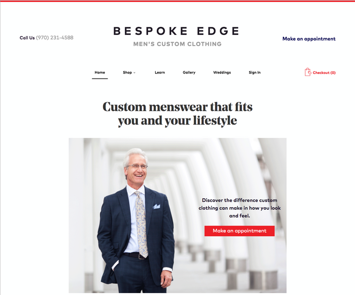
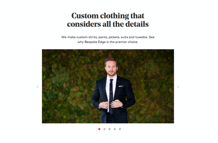
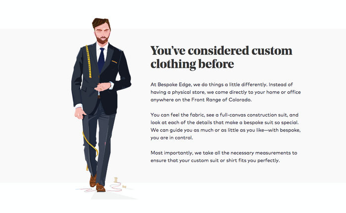
Source: bespokeedge.com License: All Rights Reserved.

Emerson Stone, a design agency in Colorado, uses two distinct typefaces around the branding, print and site design. The identity, uses only FF Mark to create a modern and trustworthy wordmark. The website and print ephemera utilize the combition of FF Mark for paragraph text and then introduces Noe Display which created a truely custom look and feel just like the company's offerings.
Bespoke Edge creates luxury custom clothing and the experience to match. Offering custom suits in Denver, Fort Collins, Boulder, and Scottsdale. The brand creates custom clothing which is why a custom feeling brand was so crucial.
License: All Rights Reserved.
License: All Rights Reserved.
License: All Rights Reserved.
License: All Rights Reserved.

License: All Rights Reserved.
This post was originally published at Fonts In Use
]]>